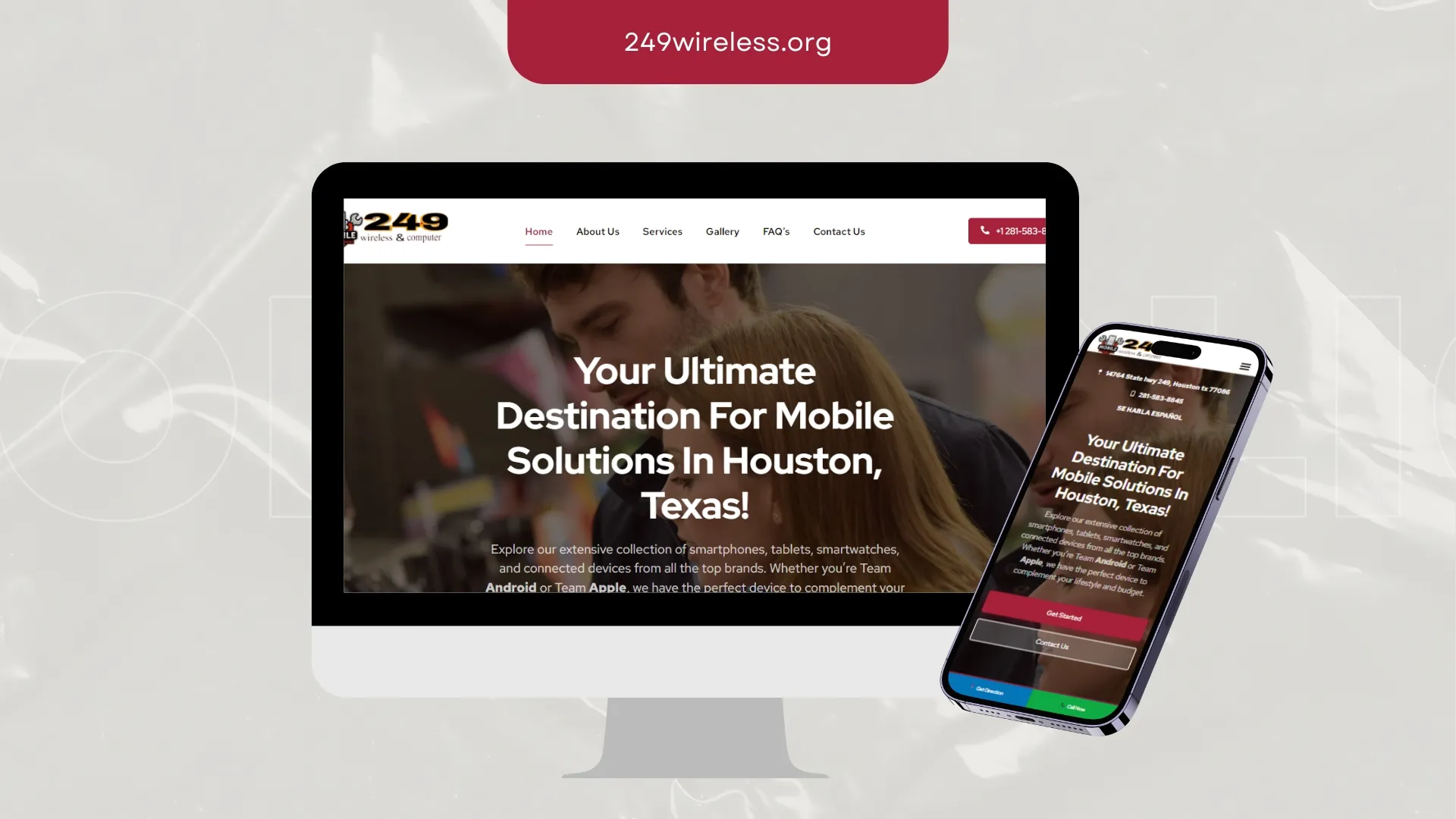
249 Wireless
249 Wireless needed credibility to register in the first few seconds. We led with proof, tightened the messaging and cleared the path to contact.
Outcome: Structure that serves both the visitor and the crawler.
Related service
Our Work
Websites, storefronts, identity systems and campaign creative built for real clients across events, education, retail, food, healthcare, logistics, nonprofit and B2B.
Portfolio
Filter by discipline. Every card opens the full-size asset.
249 Wireless needed credibility to register in the first few seconds. We led with proof, tightened the messaging and cleared the path to contact.
Outcome: Structure that serves both the visitor and the crawler.
Related service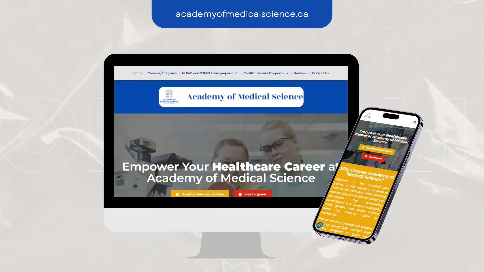
Academy of Medical Science needed visitors to understand the offer in one screen. We rebuilt the structure around that, then made everything else support it.
Outcome: Structure that serves both the visitor and the crawler.
Related service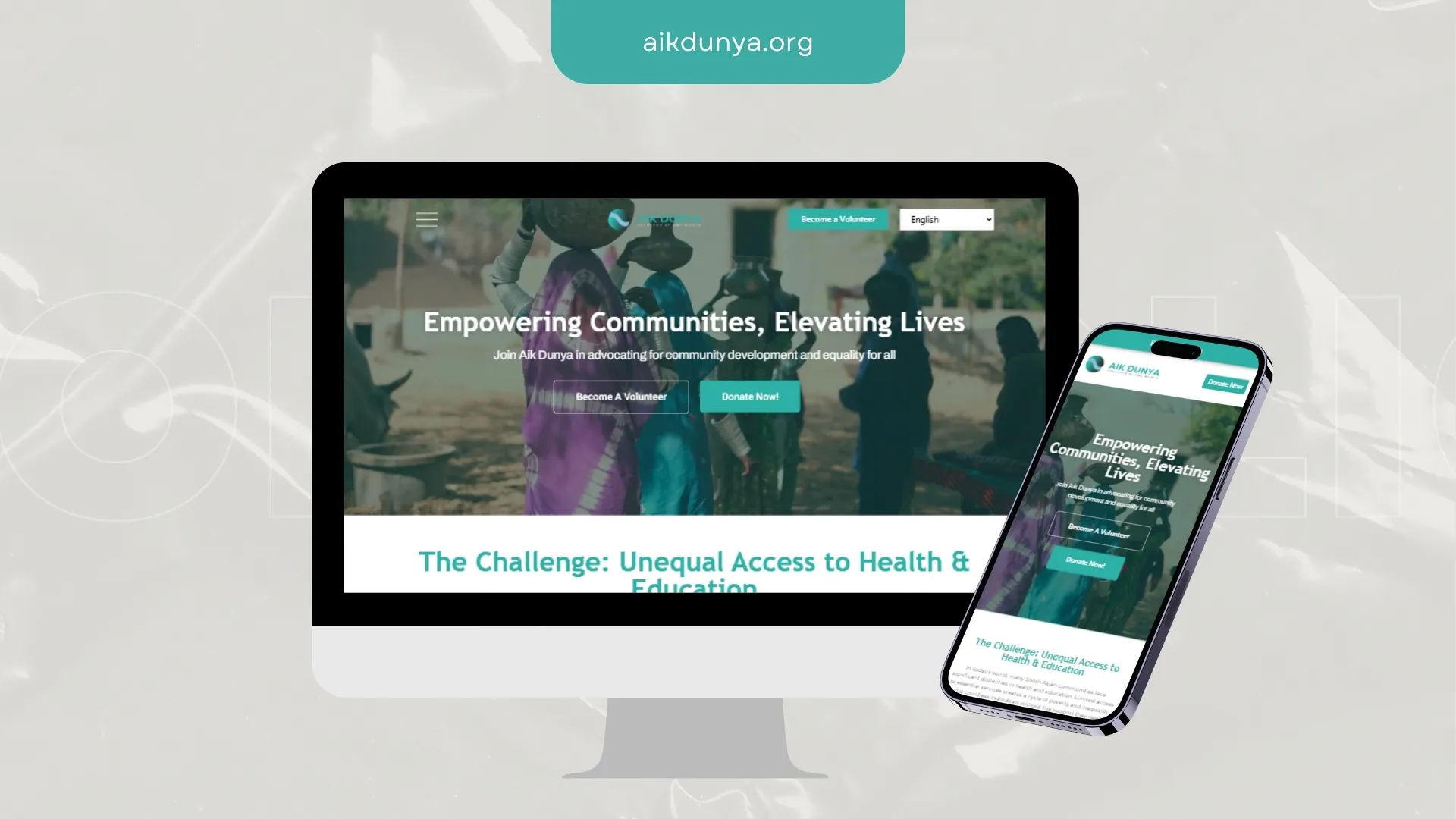
Aik Dunya had content but no order. We mapped the pages around real questions, then designed a route from arrival to enquiry.
Outcome: A faster, calmer page where the next step is never in doubt.
Related service
AppTech Ventures needed an identity flexible enough for print, packaging and a 40px app icon. We designed the system, not just the logo.
Outcome: Consistent brand application the team can handle without a designer on call.
Related service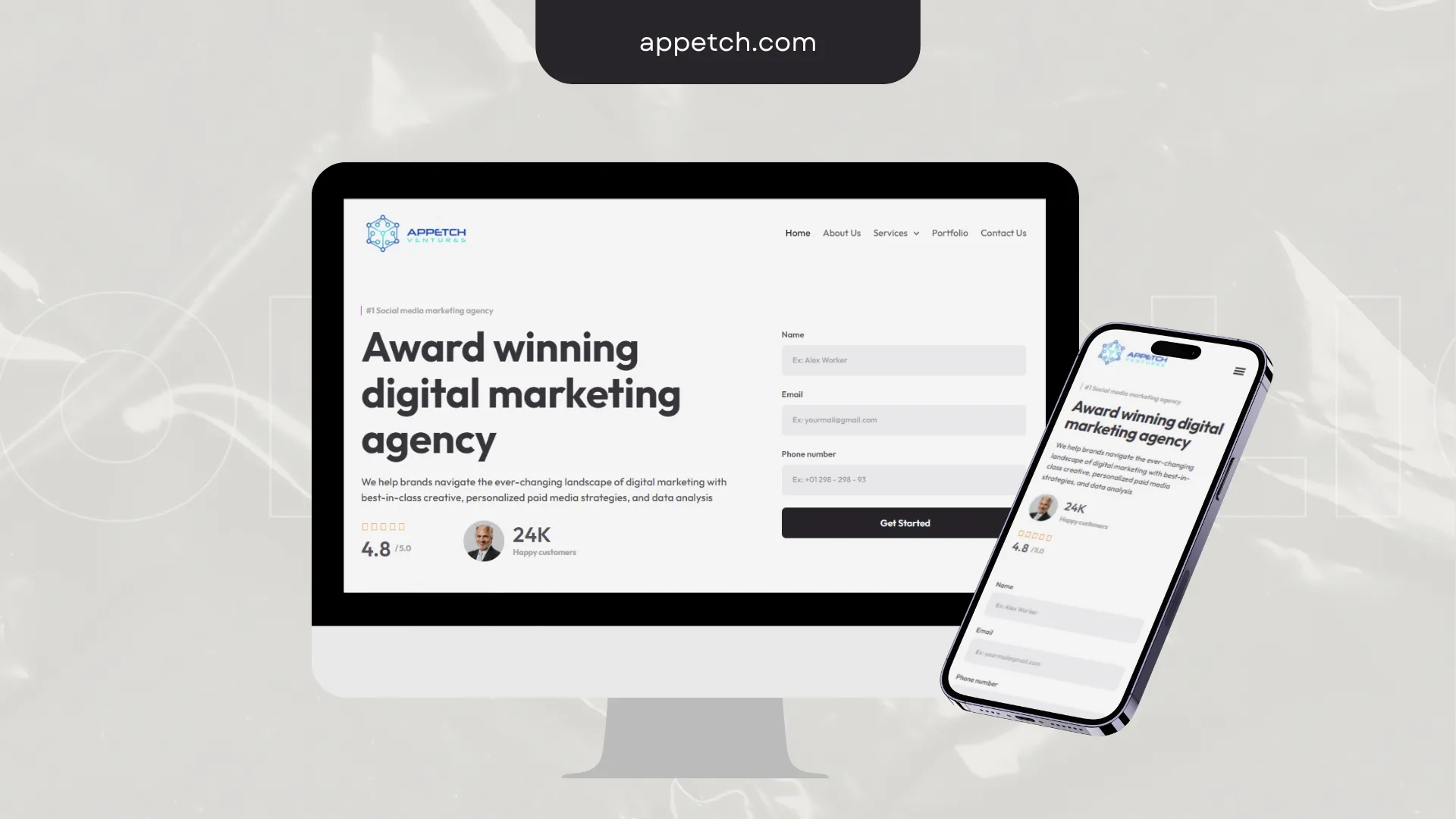
AppTech Ventures needed a responsive presence that holds up on a phone as well as a monitor. We shaped hierarchy, brand fit and conversion-ready navigation.
Outcome: Structure that serves both the visitor and the crawler.
Related service
Bammel Wireless had recognition problems before it had design problems. We set the mark, type and colour rules so the brand reads the same everywhere it appears.
Outcome: Consistent brand application the team can handle without a designer on call.
Related service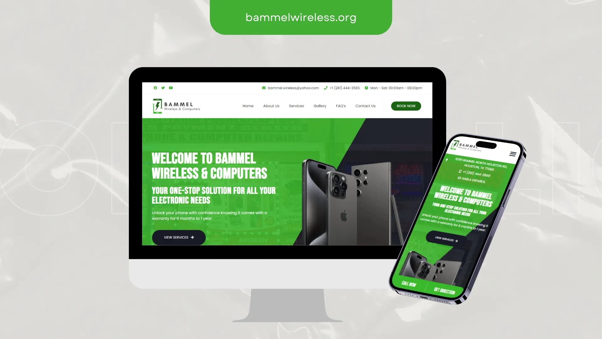
Bammel Wireless needed a responsive presence that holds up on a phone as well as a monitor. We shaped hierarchy, brand fit and conversion-ready navigation.
Outcome: A faster, calmer page where the next step is never in doubt.
Related service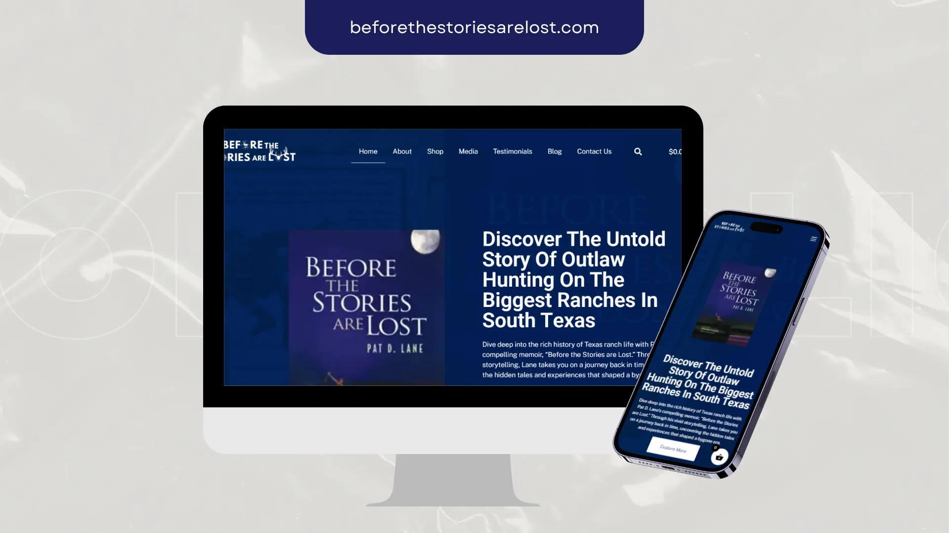
Before the Stories Are Lost needed a responsive presence that holds up on a phone as well as a monitor. We shaped hierarchy, brand fit and conversion-ready navigation.
Outcome: A faster, calmer page where the next step is never in doubt.
Related service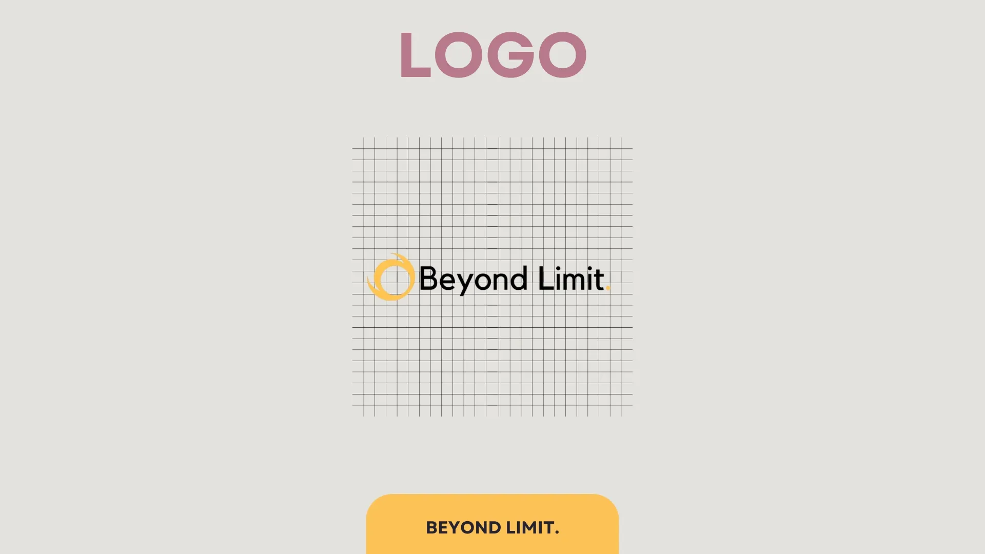
Beyond Limit needed a mark that survives a favicon, a shopfront sign and a social avatar. The identity was built around contrast, clarity and fast recall.
Outcome: A mark that scales from signage to favicon without losing itself.
Related service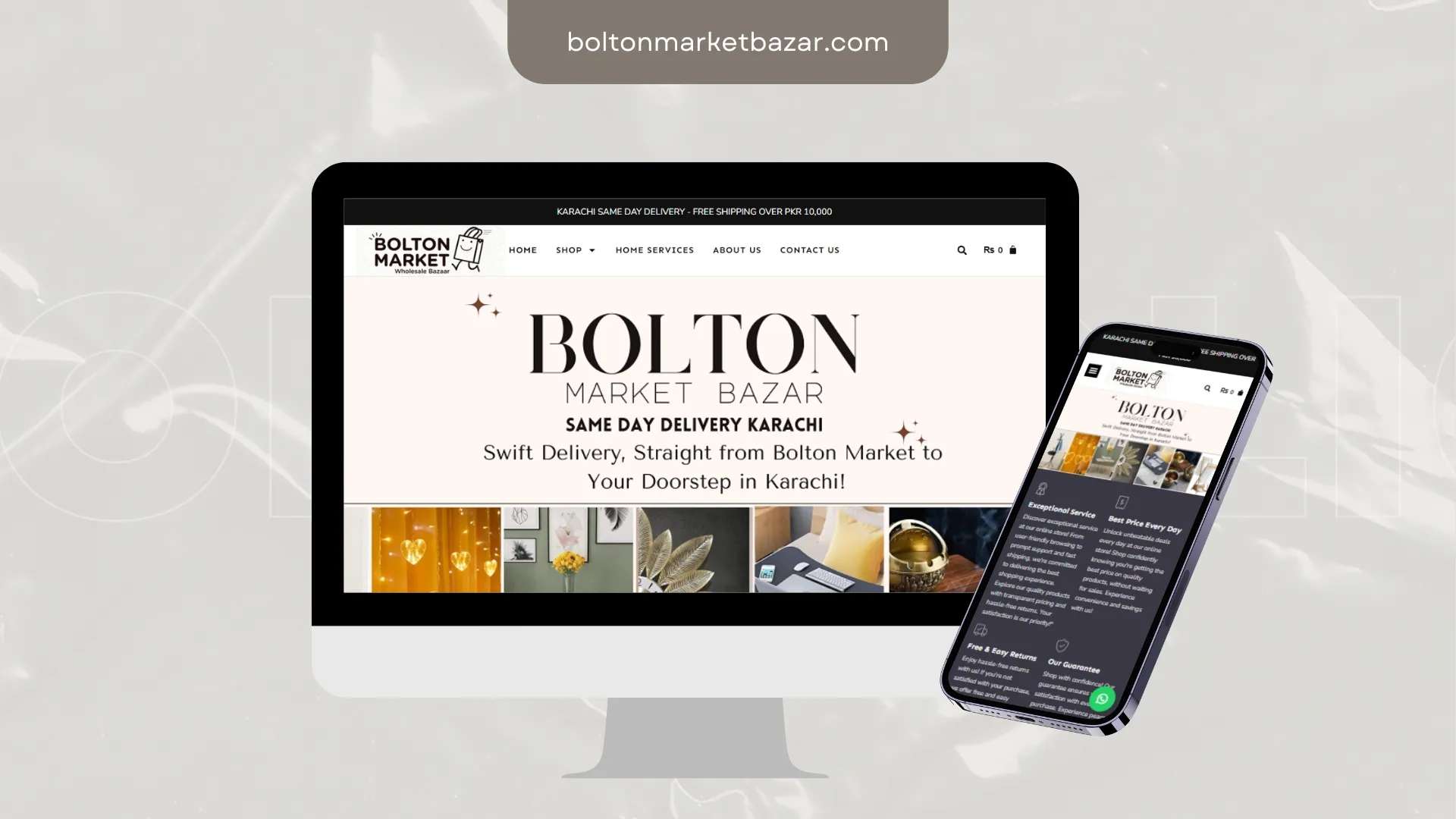
Bolton Market Bazar needed browsing that survives a thumb and a slow connection. We cut weight, sharpened merchandising and shortened the route to checkout.
Outcome: Clearer buyer journeys, better product presentation, conversion-ready structure.
Related service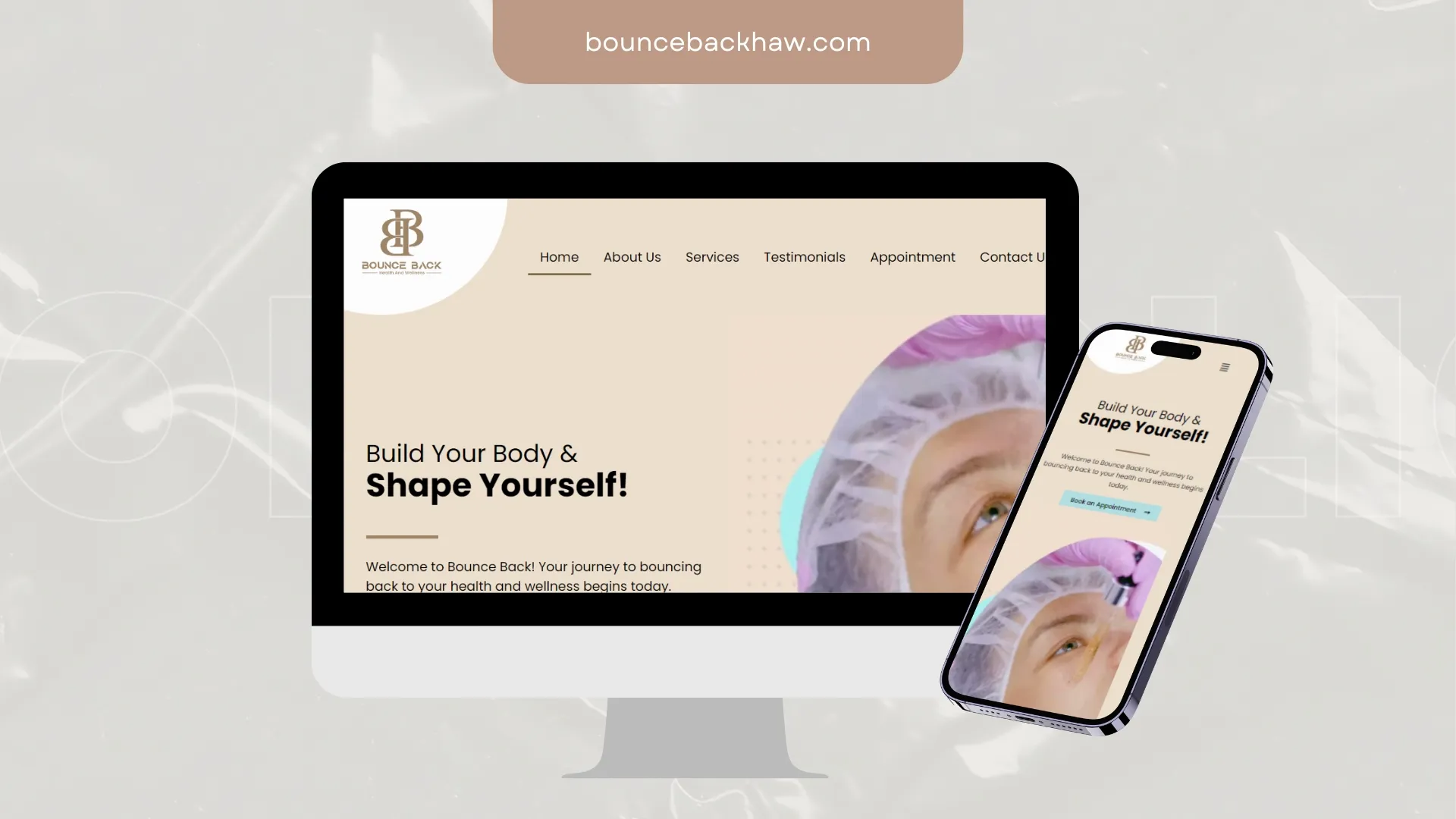
Bounce Back had content but no order. We mapped the pages around real questions, then designed a route from arrival to enquiry.
Outcome: Mobile parity with desktop, not a compromised second version.
Related service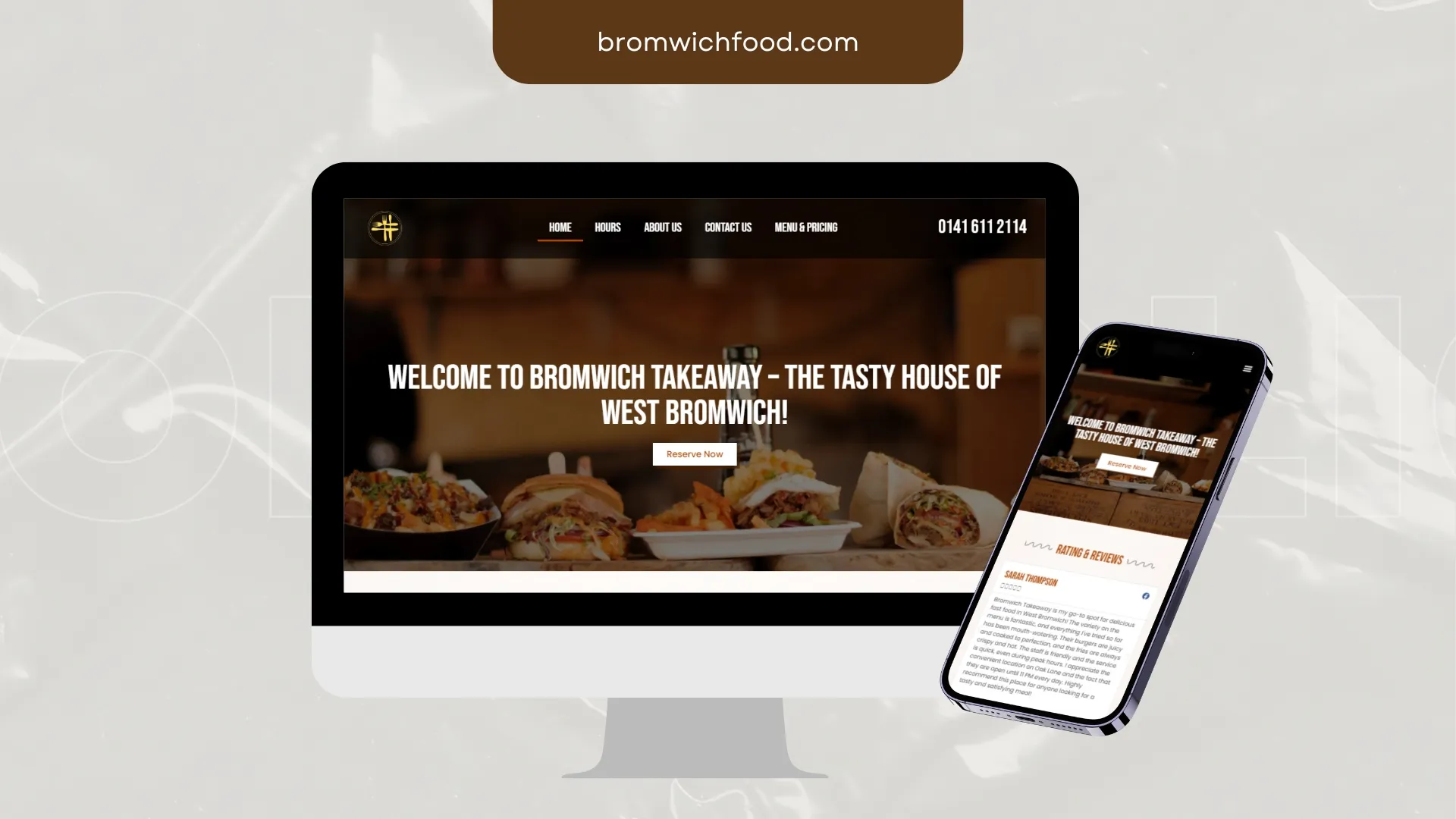
Bromwich Food needed a responsive presence that holds up on a phone as well as a monitor. We shaped hierarchy, brand fit and conversion-ready navigation.
Outcome: Clearer messaging, stronger trust signals, easier enquiry paths.
Related service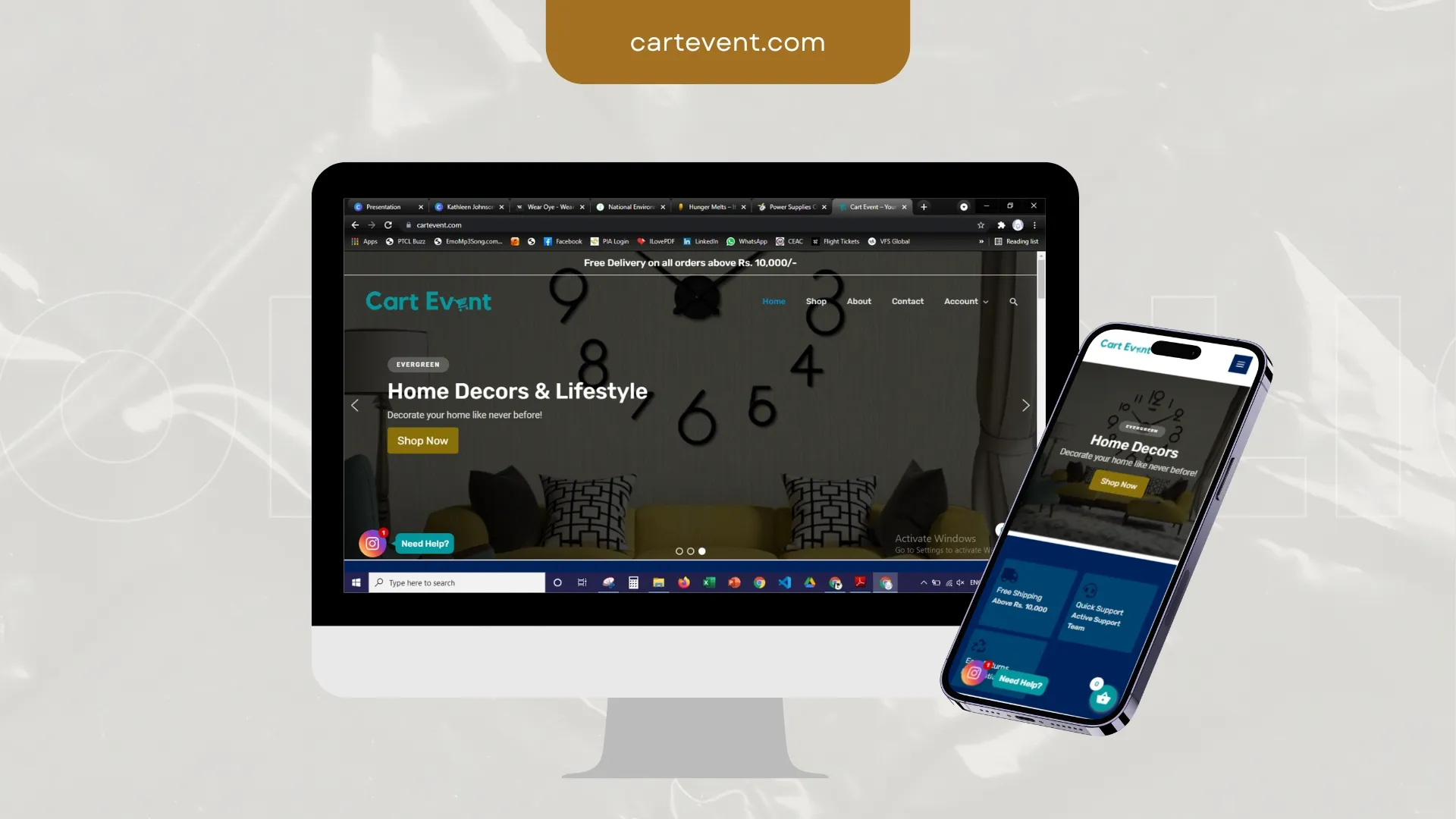
Cart Event needed browsing that survives a thumb and a slow connection. We cut weight, sharpened merchandising and shortened the route to checkout.
Outcome: Shorter path from browse to basket, especially on mobile.
Related service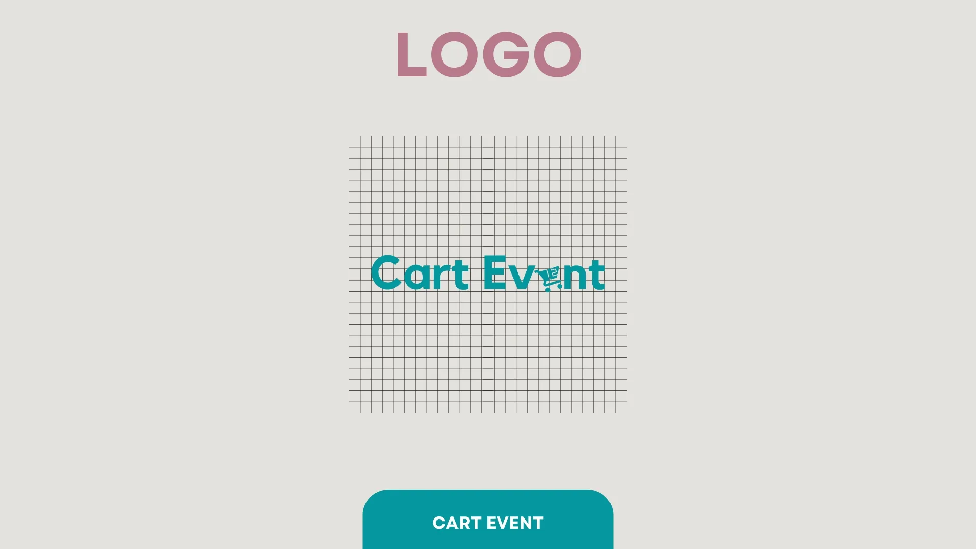
Cart Event needed an identity flexible enough for print, packaging and a 40px app icon. We designed the system, not just the logo.
Outcome: A mark that scales from signage to favicon without losing itself.
Related service
CLS Credo was posting consistently and looking inconsistent. We built templates, type rules and a content rhythm that hold the brand together across a feed.
Outcome: A repeatable content system instead of a new decision every post.
Related service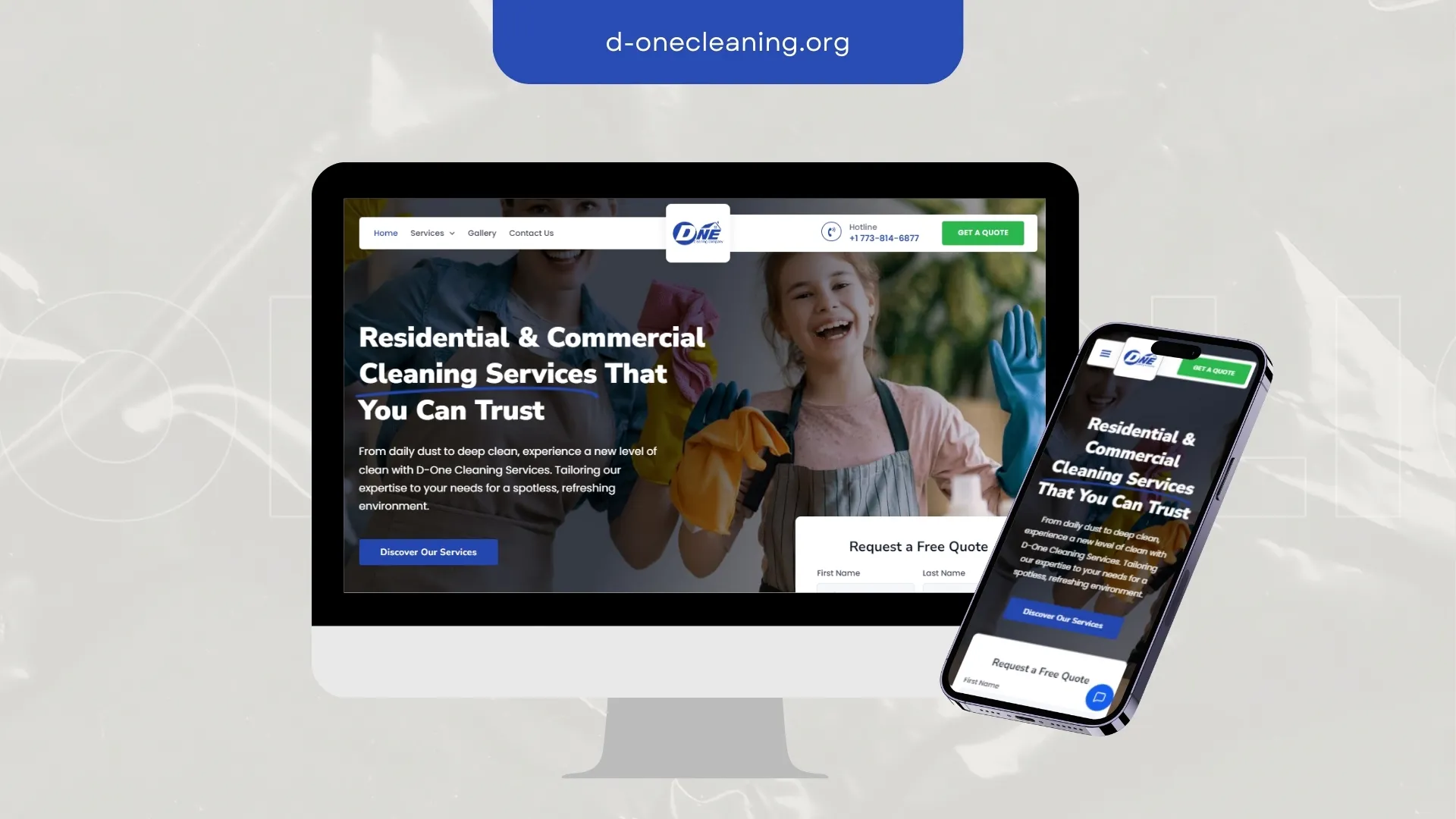
D-One Cleaning needed visitors to understand the offer in one screen. We rebuilt the structure around that, then made everything else support it.
Outcome: Mobile parity with desktop, not a compromised second version.
Related service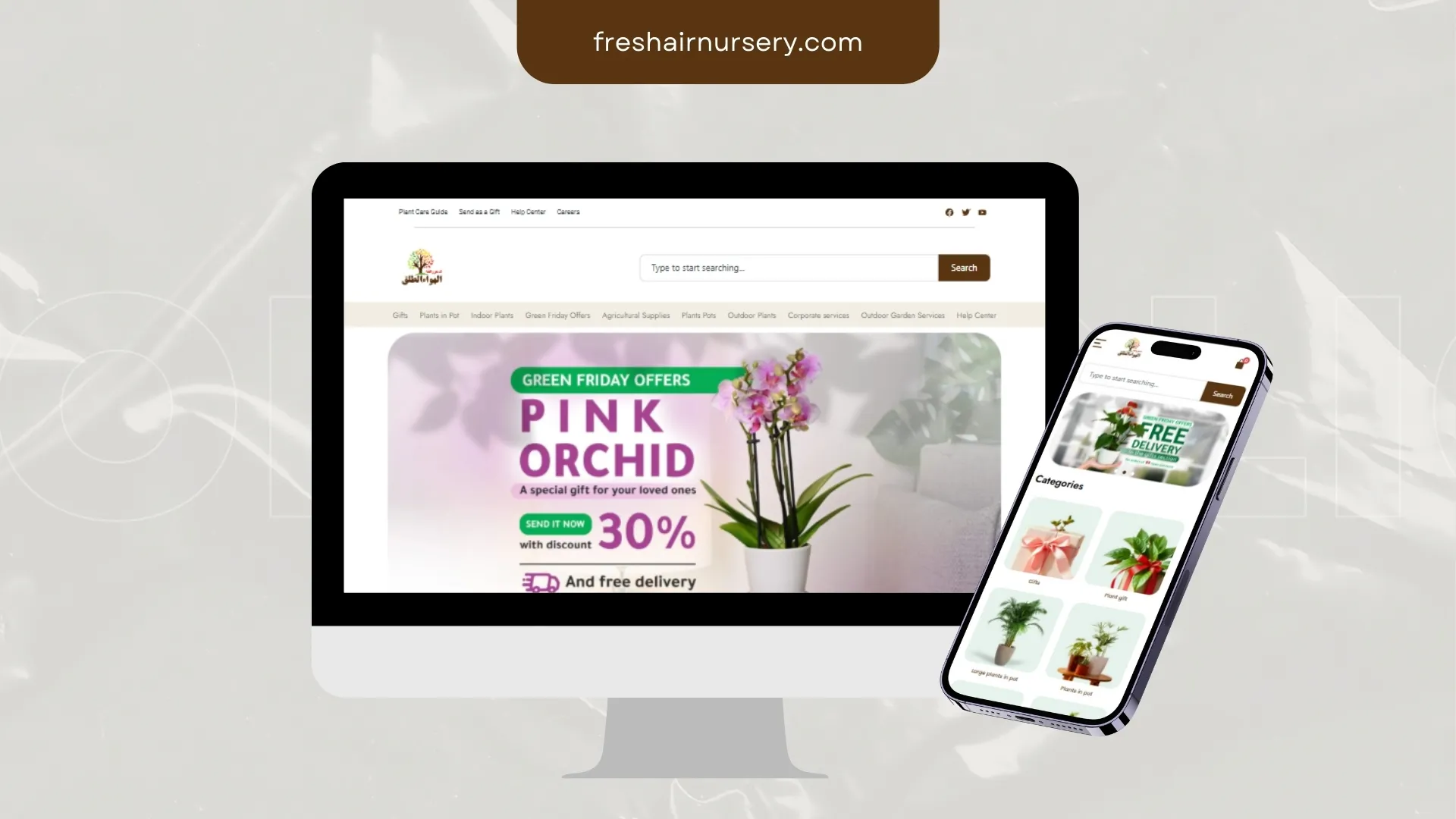
Fresh Air Nursery needed browsing that survives a thumb and a slow connection. We cut weight, sharpened merchandising and shortened the route to checkout.
Outcome: Shorter path from browse to basket, especially on mobile.
Related service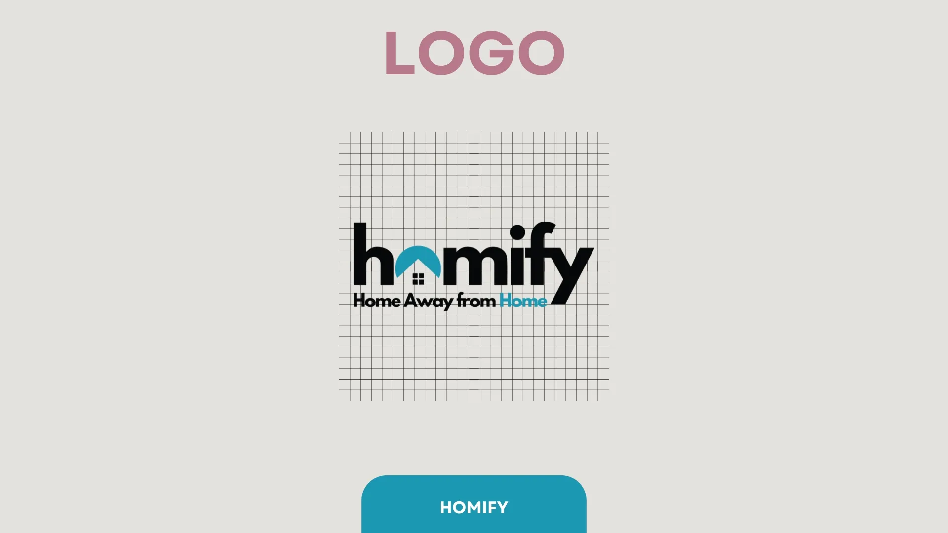
Homify came to us with a mark that fell apart at small sizes. We rebuilt it around a single strong shape and a usage kit the team can apply themselves.
Outcome: Consistent brand application the team can handle without a designer on call.
Related service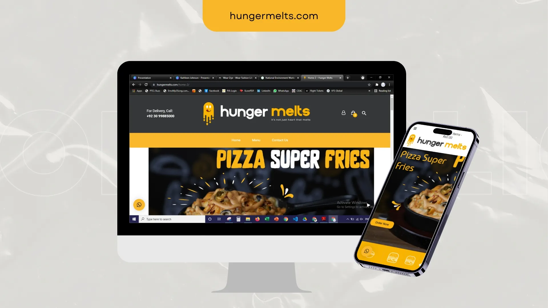
Hunger Melts had content but no order. We mapped the pages around real questions, then designed a route from arrival to enquiry.
Outcome: Clearer messaging, stronger trust signals, easier enquiry paths.
Related service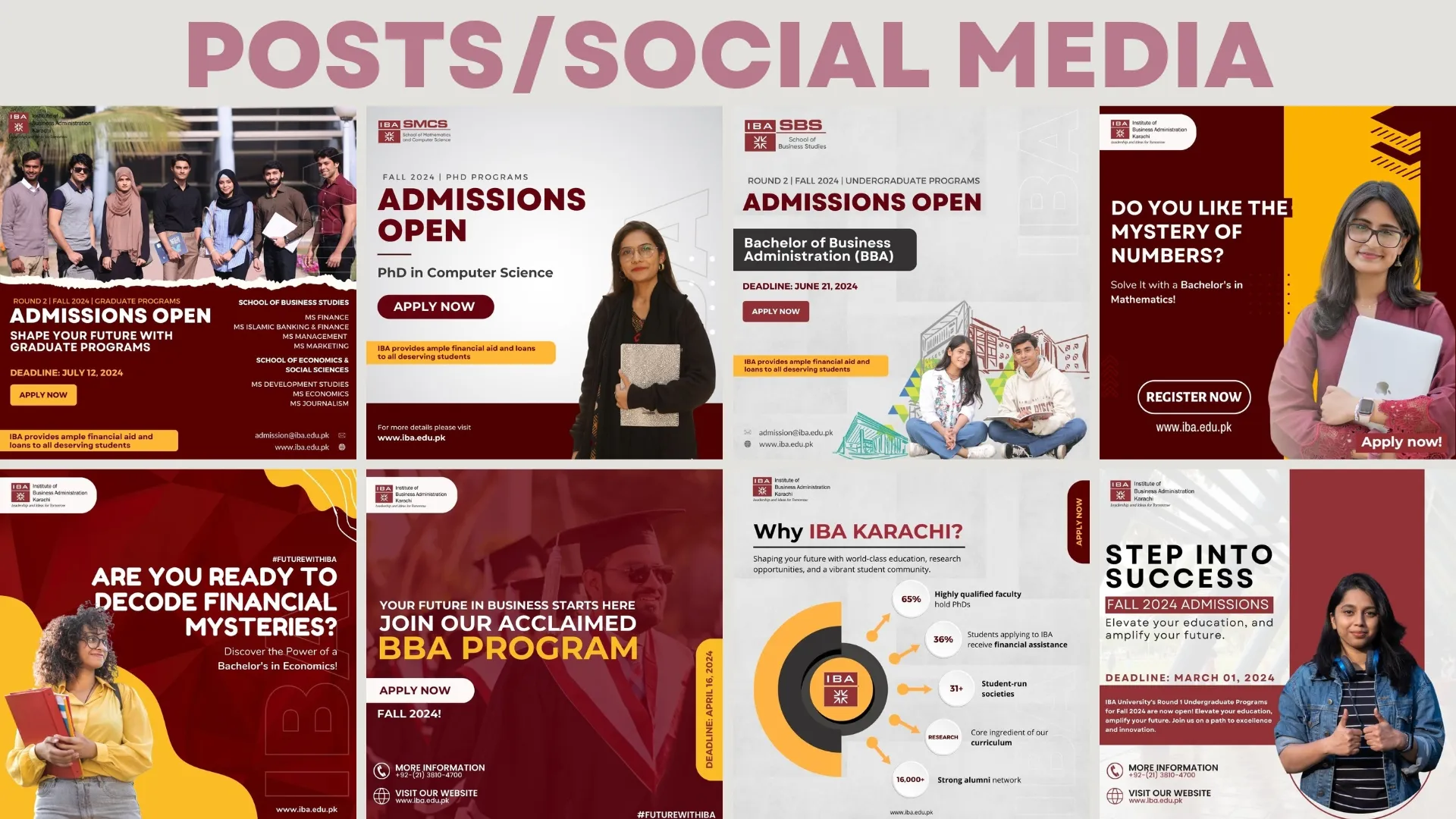
IBA Admissions needed campaign creative that reads at thumb-speed. We set the visual system, message hierarchy and repeatable layouts the team keeps running.
Outcome: Assets that hold the brand together across a scrolling feed.
Related service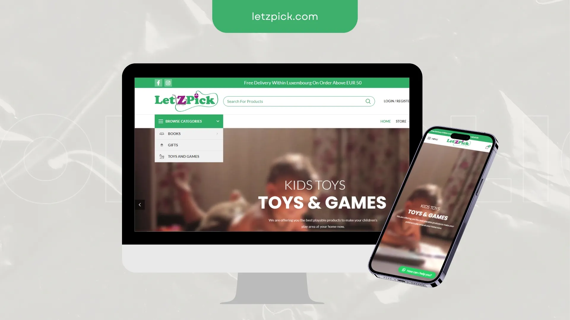
LetzPick had traffic and a conversion problem. We rebuilt category structure, product pages and the mobile buying flow around the actual decision.
Outcome: Clearer buyer journeys, better product presentation, conversion-ready structure.
Related service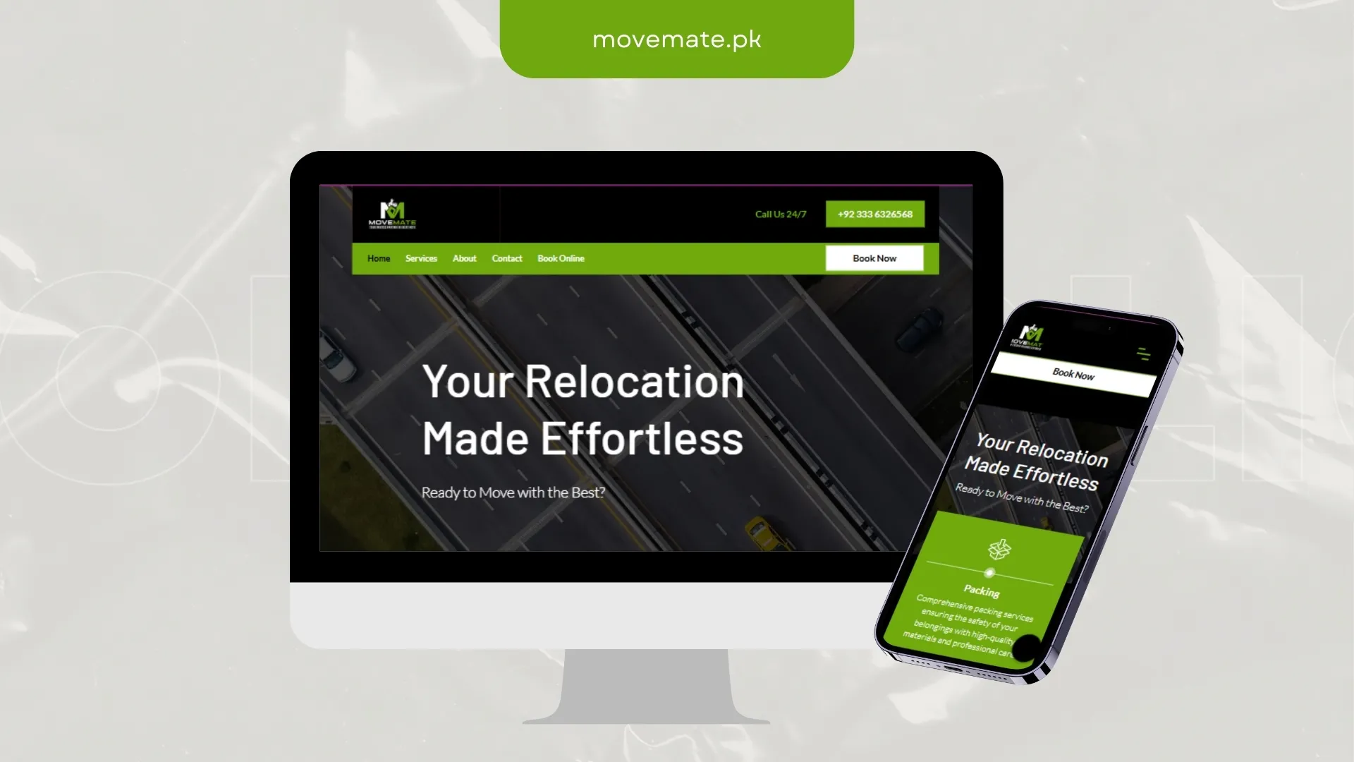
MoveMate needed credibility to register in the first few seconds. We led with proof, tightened the messaging and cleared the path to contact.
Outcome: Mobile parity with desktop, not a compromised second version.
Related service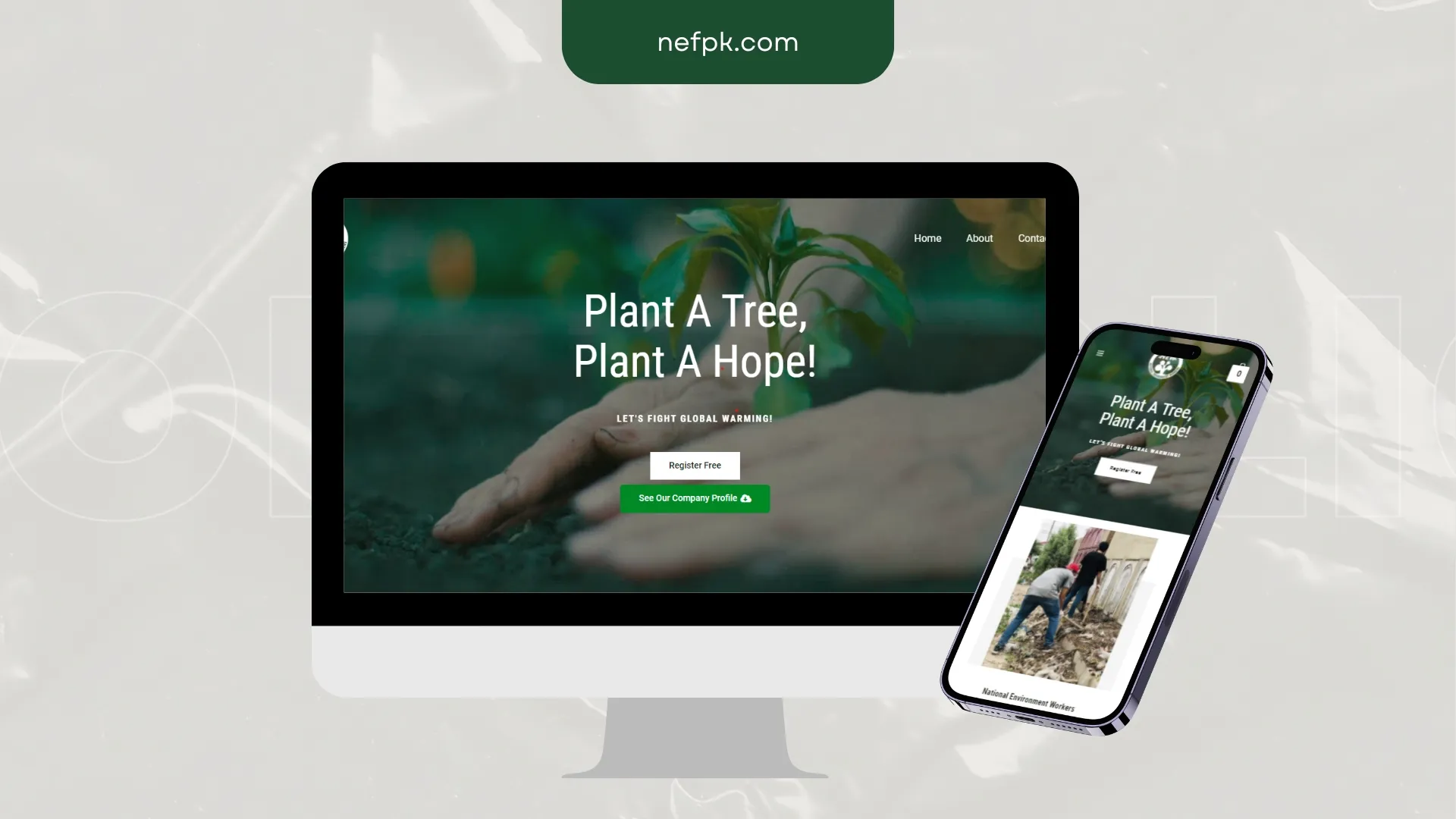
NEFP needed speed and clarity more than decoration. We stripped the layout back, fixed the mobile journey and made the next step obvious.
Outcome: A faster, calmer page where the next step is never in doubt.
Related service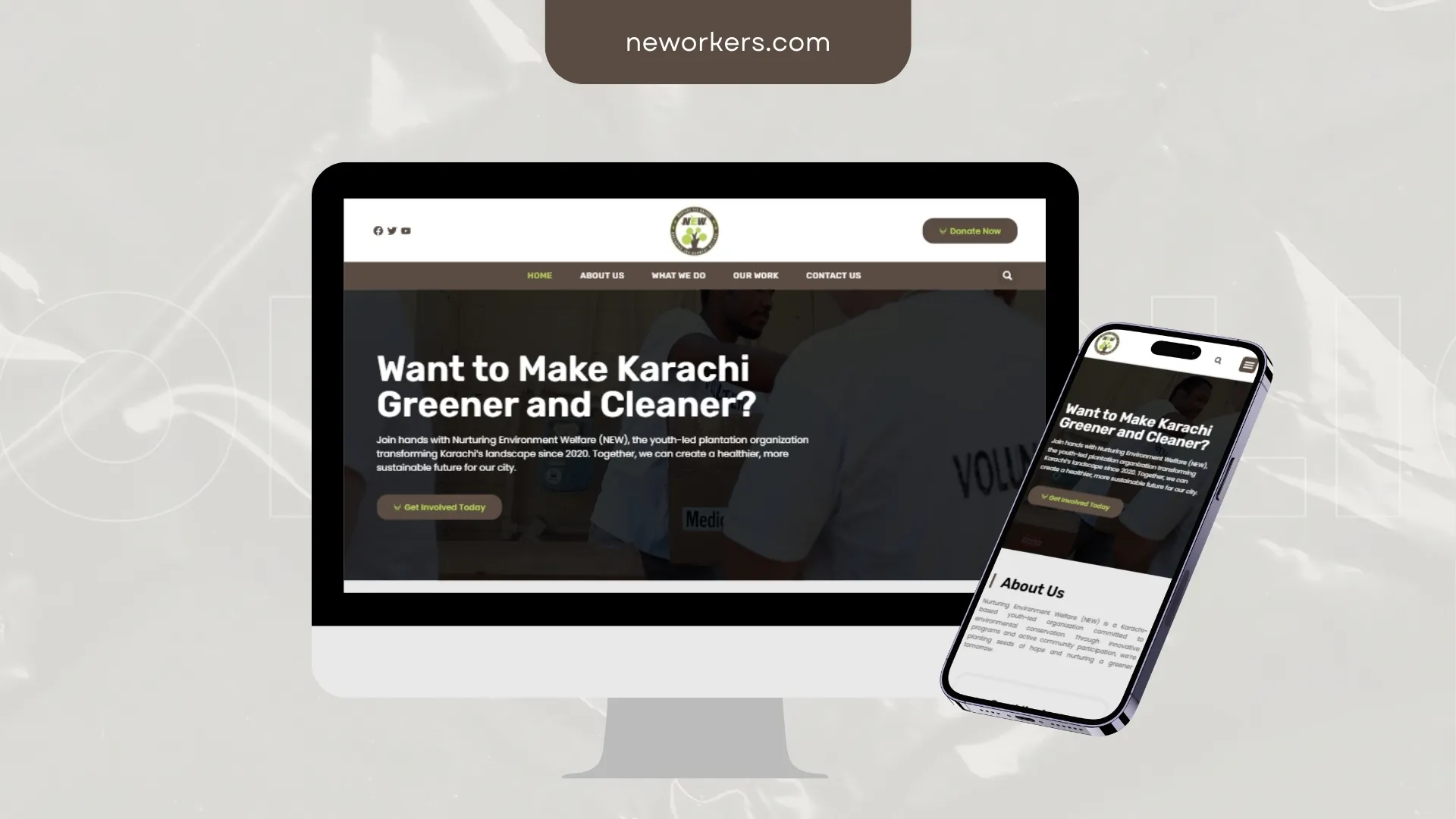
New Workers needed credibility to register in the first few seconds. We led with proof, tightened the messaging and cleared the path to contact.
Outcome: Mobile parity with desktop, not a compromised second version.
Related service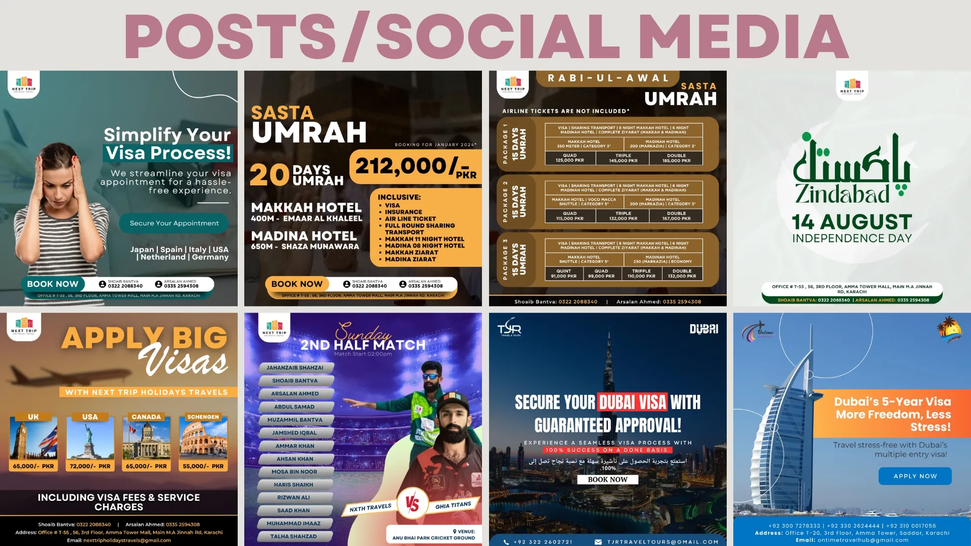
Next Trip Holidays was posting consistently and looking inconsistent. We built templates, type rules and a content rhythm that hold the brand together across a feed.
Outcome: Assets that hold the brand together across a scrolling feed.
Related service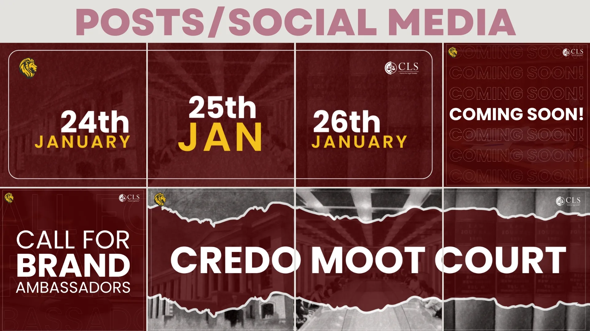
Next Trip was posting consistently and looking inconsistent. We built templates, type rules and a content rhythm that hold the brand together across a feed.
Outcome: A repeatable content system instead of a new decision every post.
Related service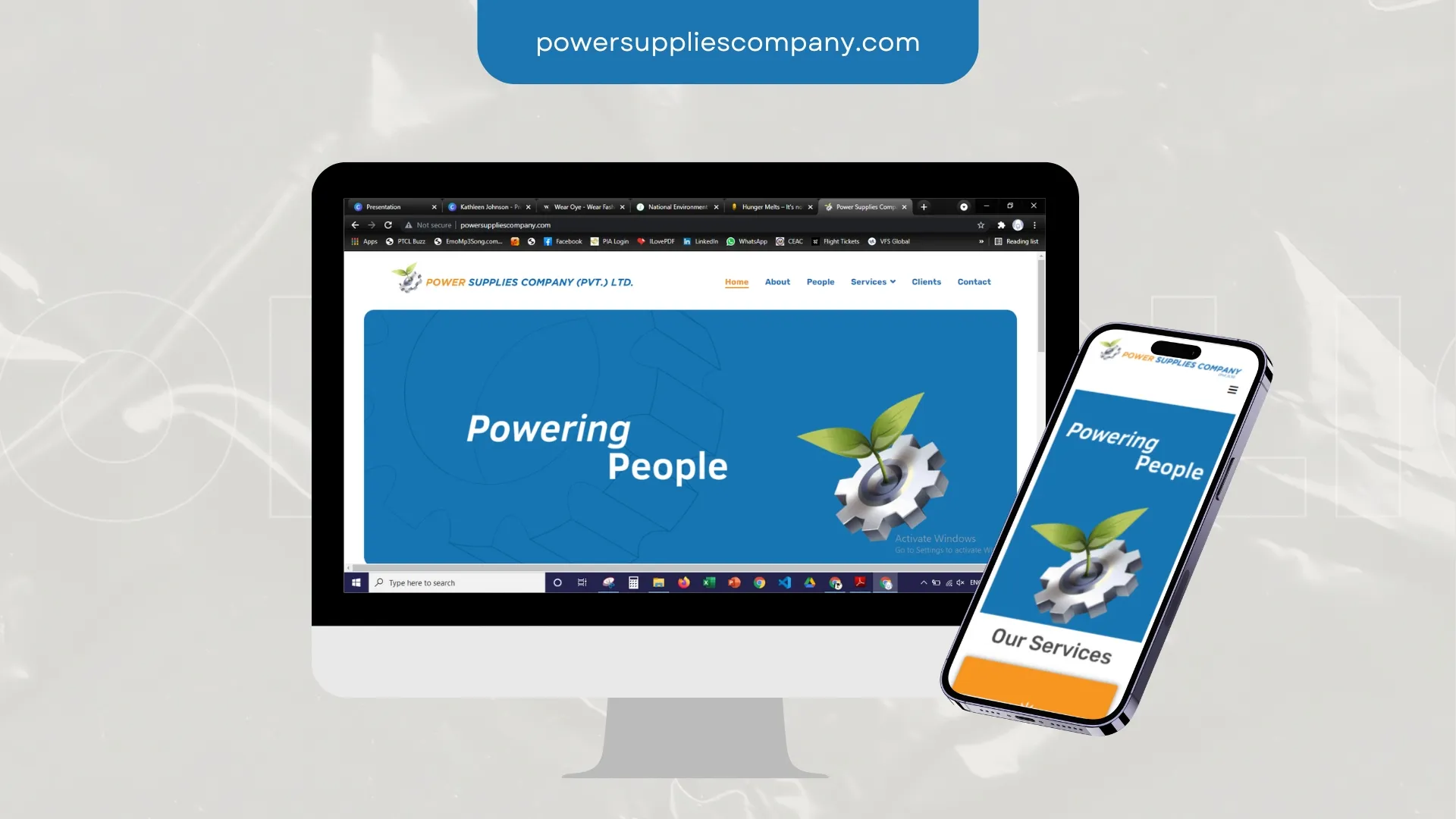
Power Supplies Company needed visitors to understand the offer in one screen. We rebuilt the structure around that, then made everything else support it.
Outcome: Mobile parity with desktop, not a compromised second version.
Related service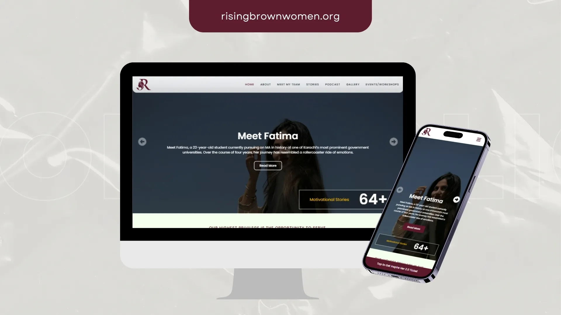
Rising Brown Women needed speed and clarity more than decoration. We stripped the layout back, fixed the mobile journey and made the next step obvious.
Outcome: Structure that serves both the visitor and the crawler.
Related service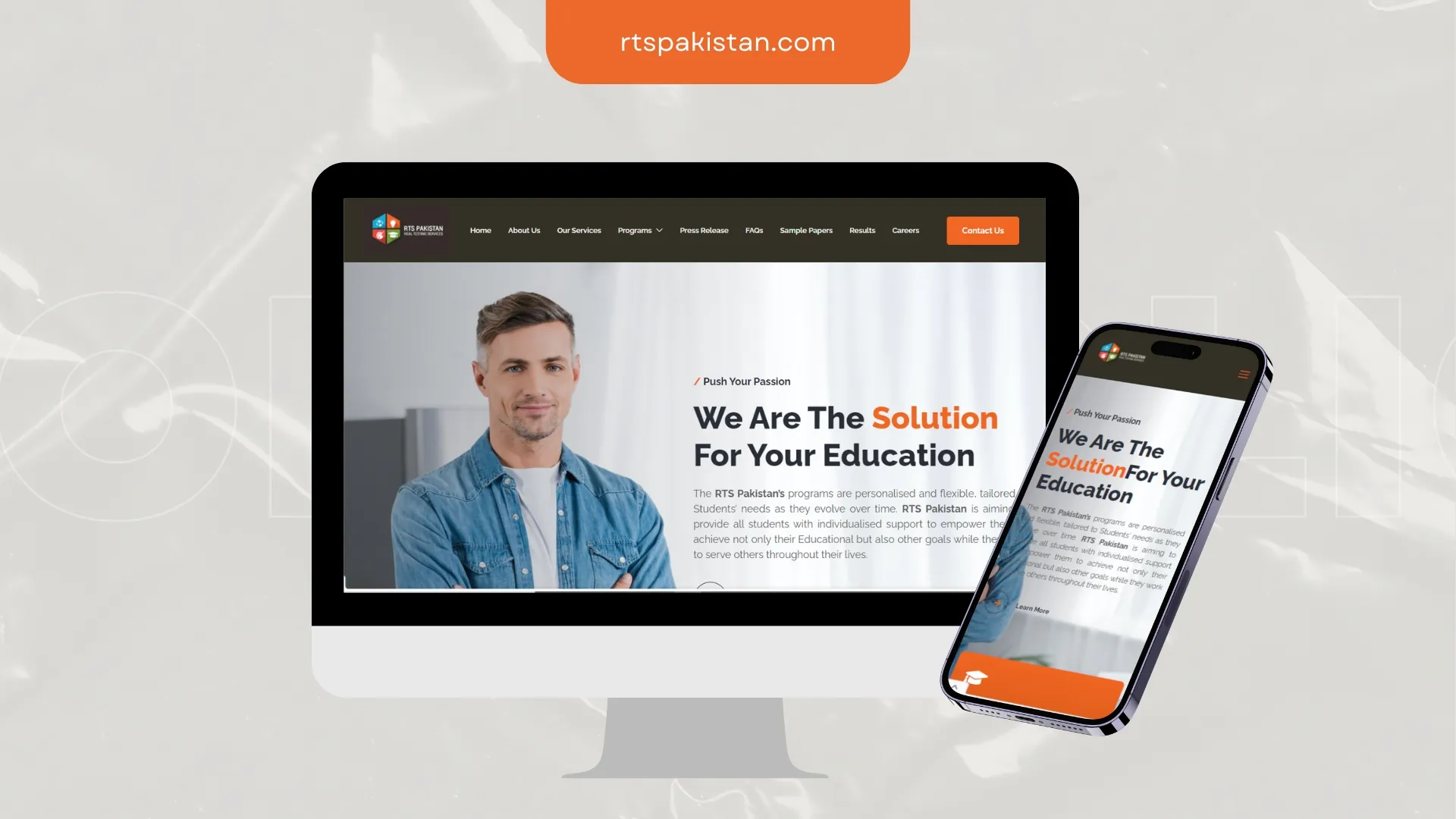
RTS Pakistan needed credibility to register in the first few seconds. We led with proof, tightened the messaging and cleared the path to contact.
Outcome: Mobile parity with desktop, not a compromised second version.
Related service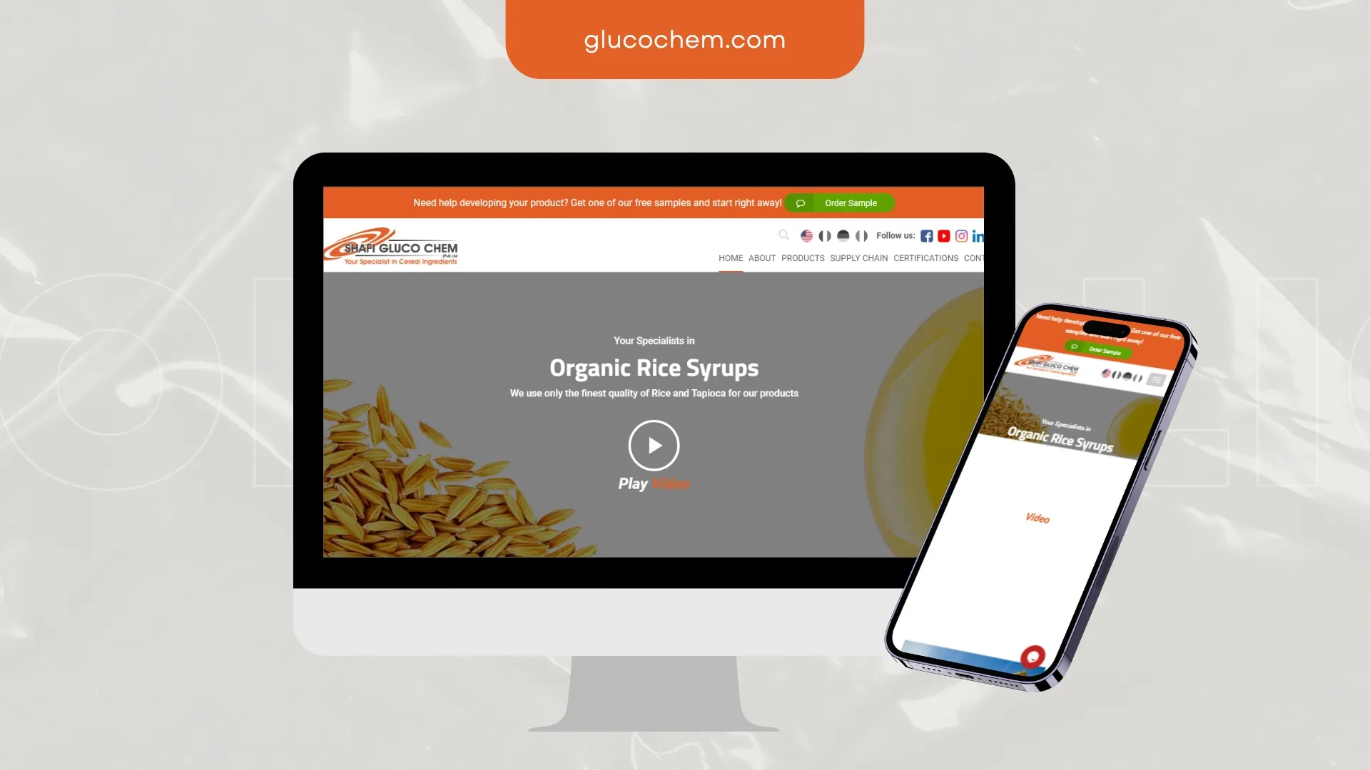
Shafi Gluco Chem needed visitors to understand the offer in one screen. We rebuilt the structure around that, then made everything else support it.
Outcome: Clearer messaging, stronger trust signals, easier enquiry paths.
Related service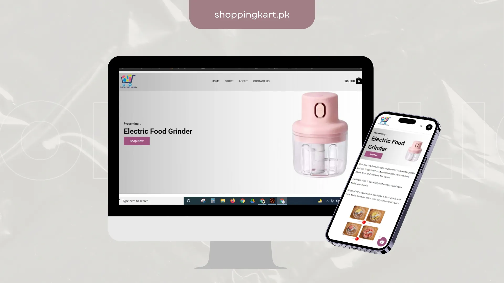
Shopping Kart needed a storefront treated as a sales system, not a catalogue. We restructured discovery, trust signals and the path to checkout.
Outcome: Shorter path from browse to basket, especially on mobile.
Related service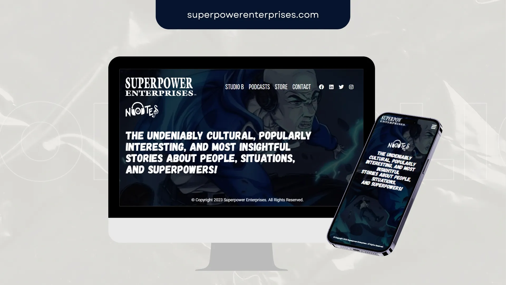
Superpower Enterprises needed speed and clarity more than decoration. We stripped the layout back, fixed the mobile journey and made the next step obvious.
Outcome: Structure that serves both the visitor and the crawler.
Related service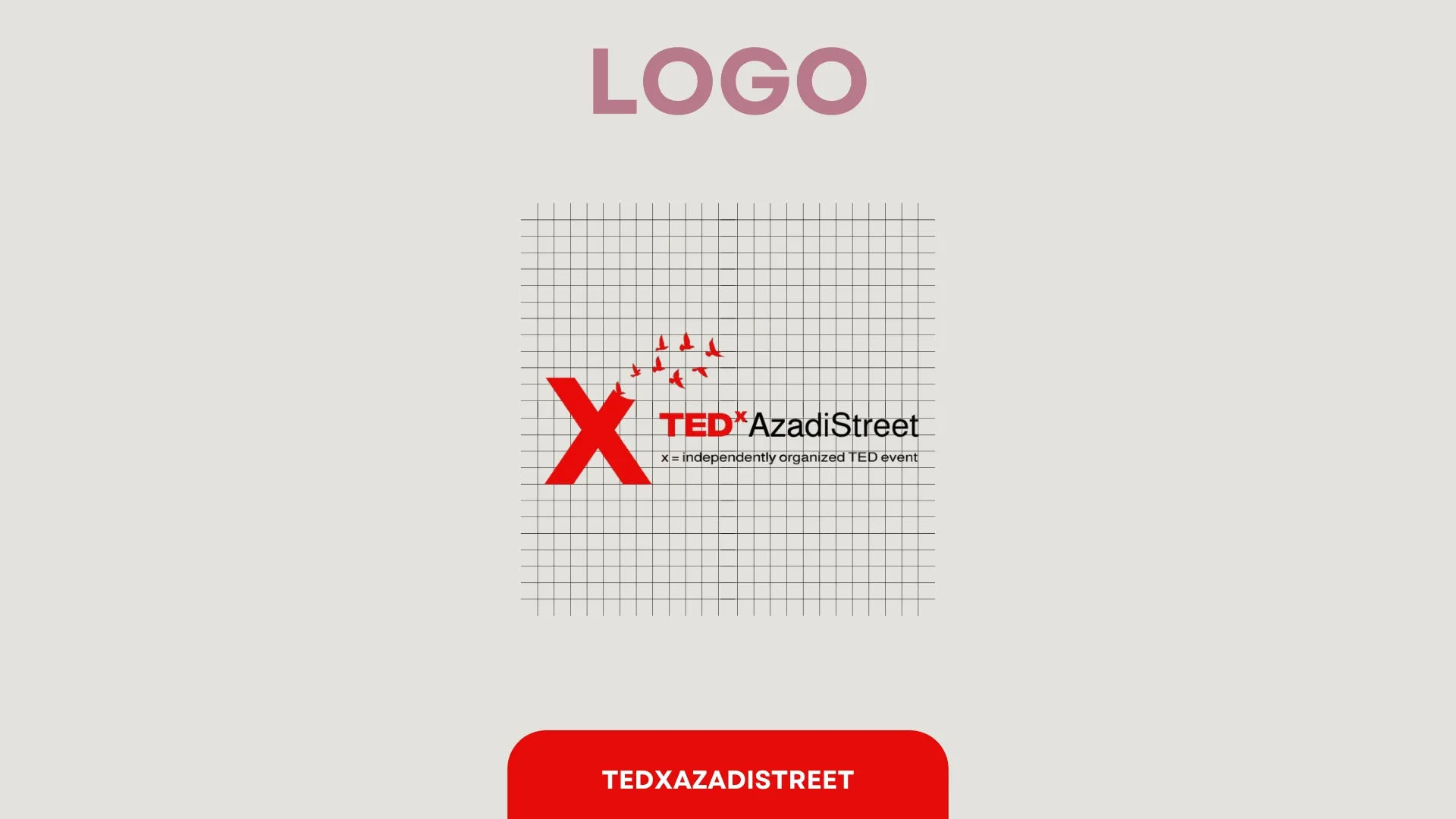
TEDx AzadiStreet came to us with a mark that fell apart at small sizes. We rebuilt it around a single strong shape and a usage kit the team can apply themselves.
Outcome: Stronger recognition, cleaner usage rules, a more flexible identity system.
Related service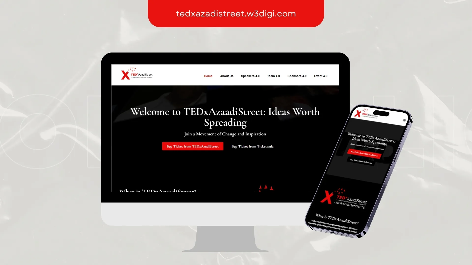
TEDx AzadiStreet needed speed and clarity more than decoration. We stripped the layout back, fixed the mobile journey and made the next step obvious.
Outcome: Structure that serves both the visitor and the crawler.
Related service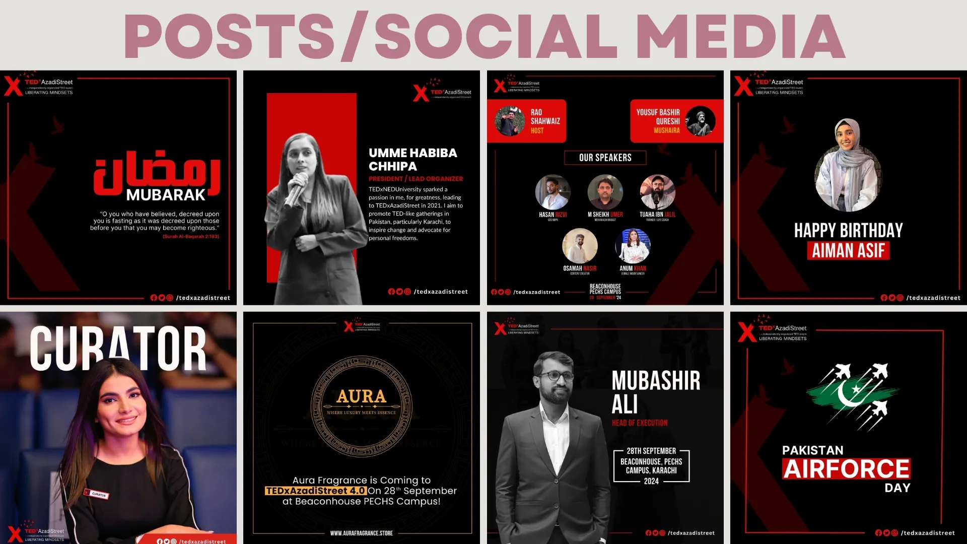
TEDx AzadiStreet needed assets that work as a grid, not as one-offs. We designed the series so each post earns attention and still belongs to the set.
Outcome: Sharper campaign visibility, consistent layouts, stronger audience recall.
Related service
TJR Traders came to us with a mark that fell apart at small sizes. We rebuilt it around a single strong shape and a usage kit the team can apply themselves.
Outcome: Stronger recognition, cleaner usage rules, a more flexible identity system.
Related service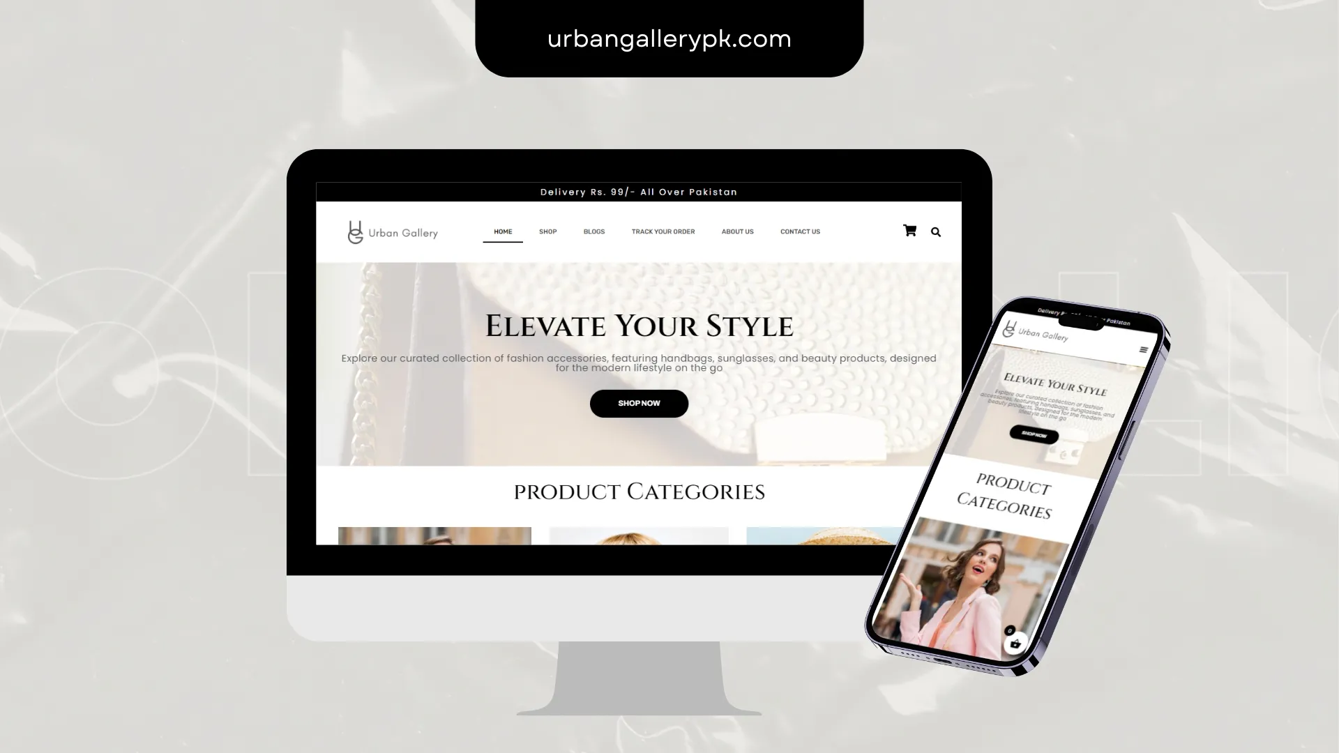
Urban Gallery needed product pages that answer objections before the basket. We restructured imagery, copy blocks, delivery signals and calls to action.
Outcome: Product pages that answer the objection before it becomes an exit.
Related service
Veterans Wireless needed a mark that survives a favicon, a shopfront sign and a social avatar. The identity was built around contrast, clarity and fast recall.
Outcome: Consistent brand application the team can handle without a designer on call.
Related service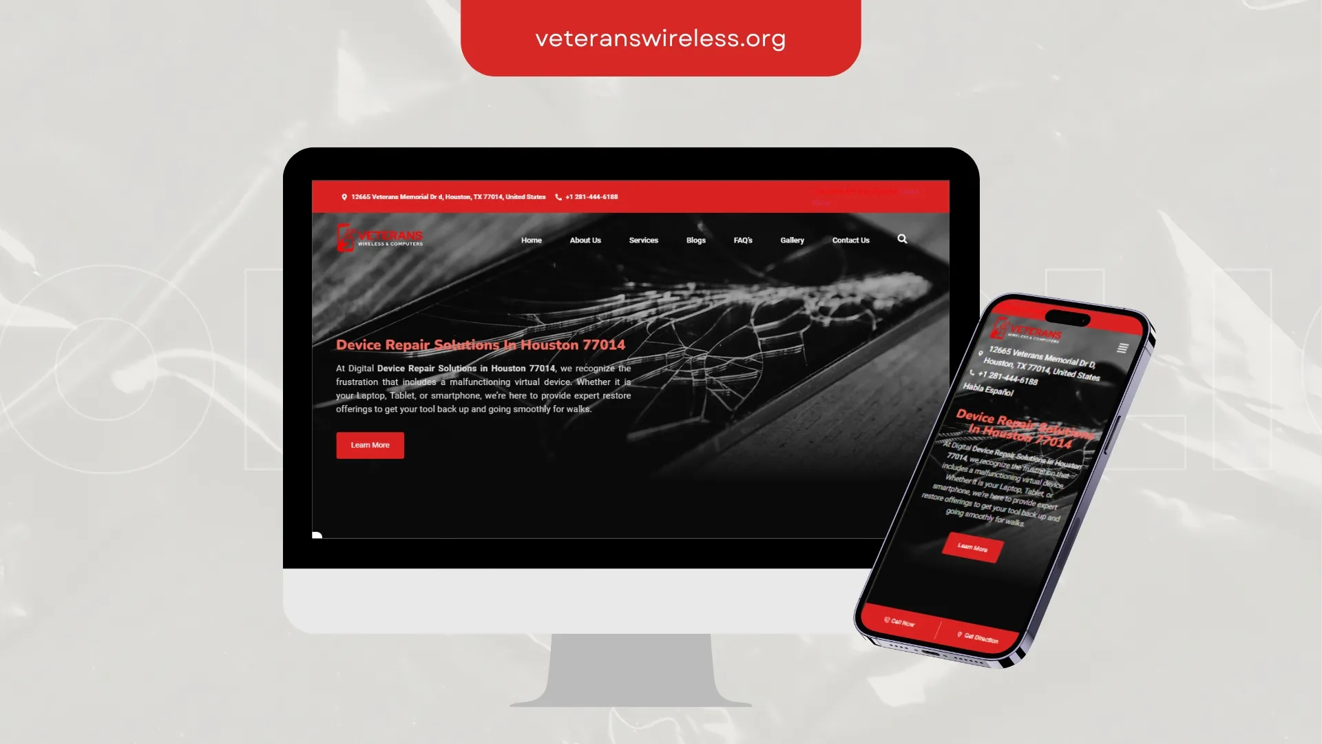
Veterans Wireless needed credibility to register in the first few seconds. We led with proof, tightened the messaging and cleared the path to contact.
Outcome: Structure that serves both the visitor and the crawler.
Related service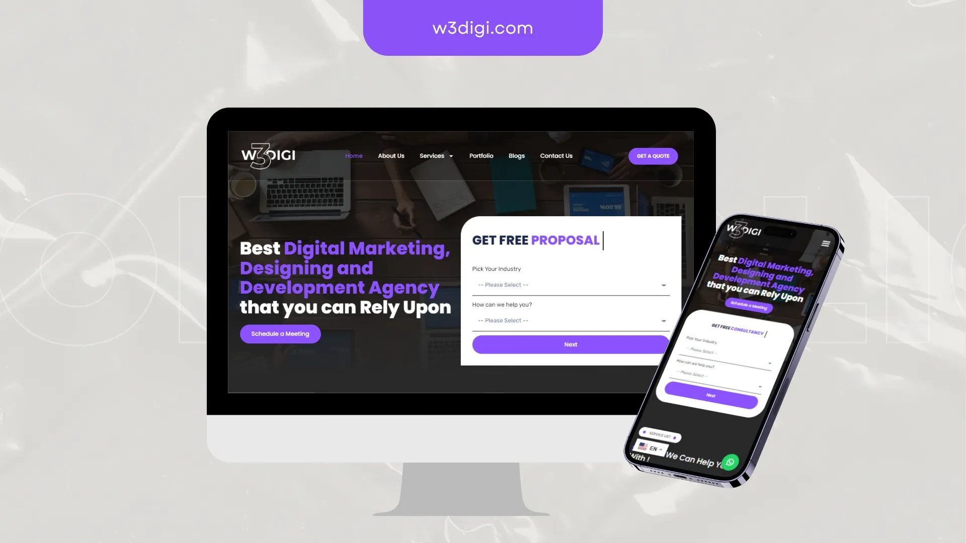
W3Digi needed credibility to register in the first few seconds. We led with proof, tightened the messaging and cleared the path to contact.
Outcome: Structure that serves both the visitor and the crawler.
Related service
W3Digi needed assets that work as a grid, not as one-offs. We designed the series so each post earns attention and still belongs to the set.
Outcome: Assets that hold the brand together across a scrolling feed.
Related service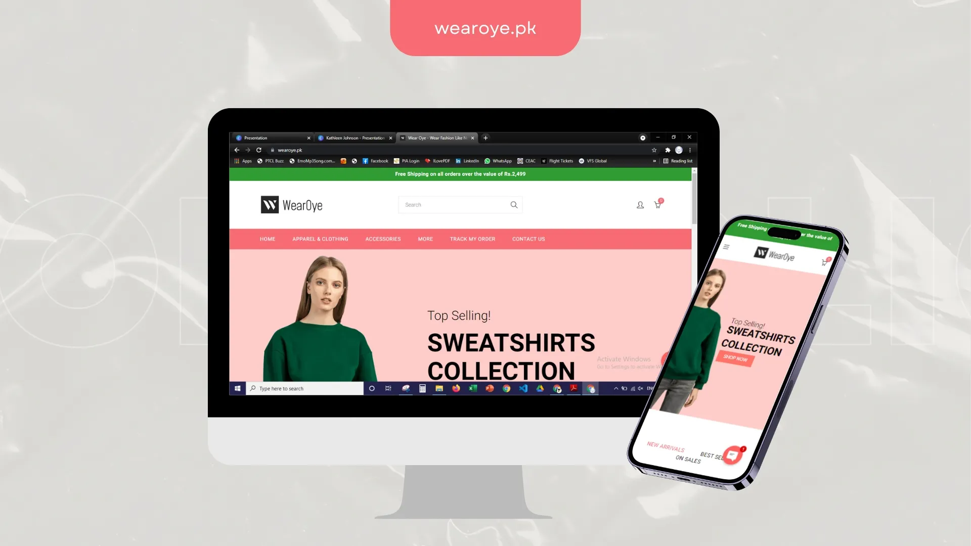
Wear Oye needed browsing that survives a thumb and a slow connection. We cut weight, sharpened merchandising and shortened the route to checkout.
Outcome: Shorter path from browse to basket, especially on mobile.
Related service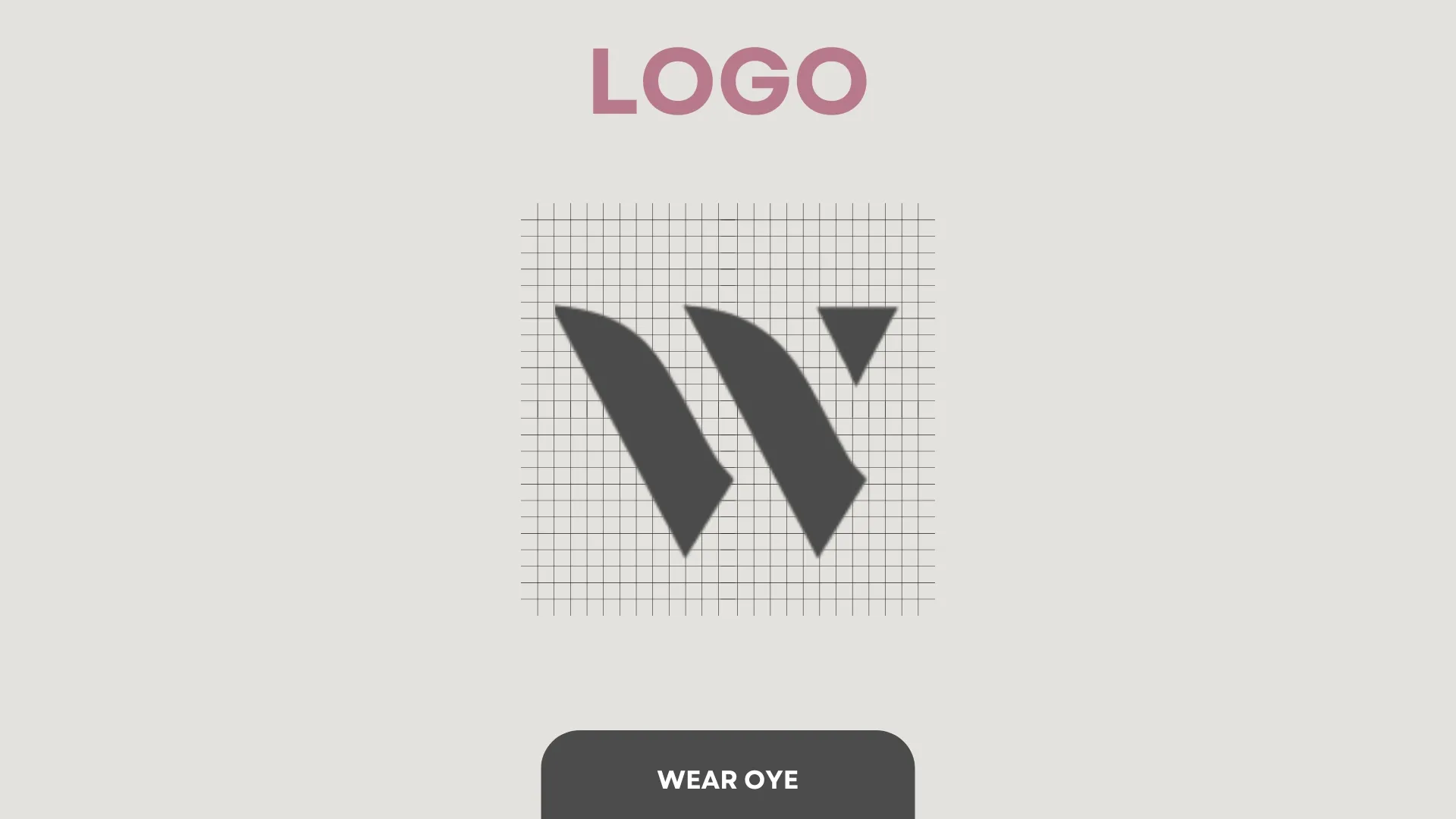
Wear Oye needed an identity flexible enough for print, packaging and a 40px app icon. We designed the system, not just the logo.
Outcome: A mark that scales from signage to favicon without losing itself.
Related service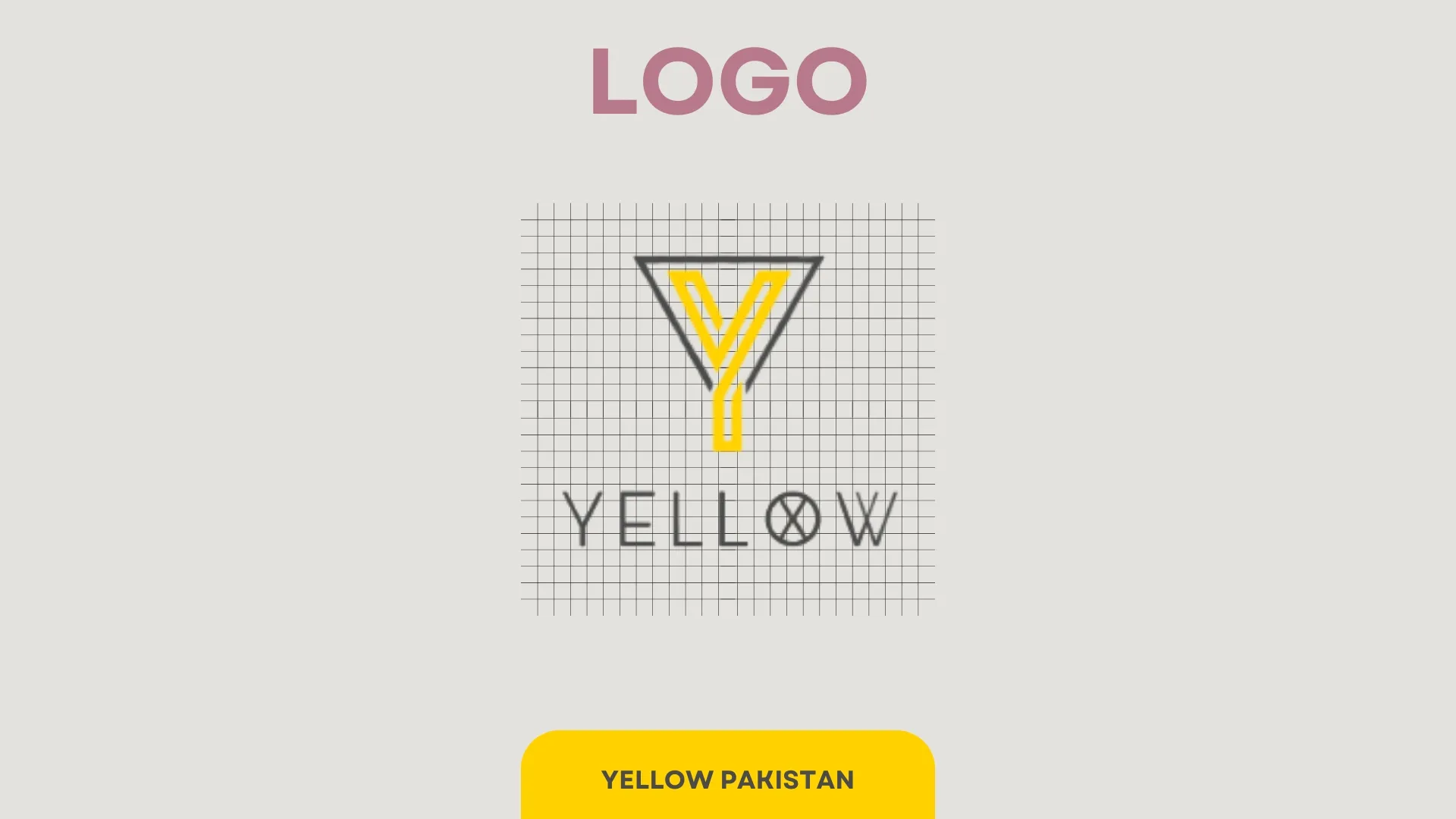
Yellow Pakistan came to us with a mark that fell apart at small sizes. We rebuilt it around a single strong shape and a usage kit the team can apply themselves.
Outcome: Consistent brand application the team can handle without a designer on call.
Related service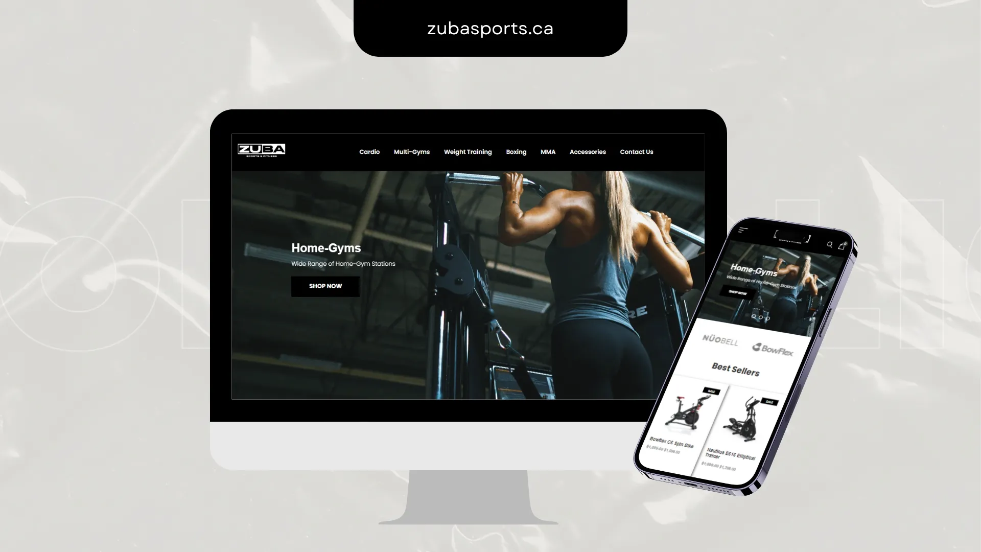
Zuba Sports had traffic and a conversion problem. We rebuilt category structure, product pages and the mobile buying flow around the actual decision.
Outcome: Shorter path from browse to basket, especially on mobile.
Related serviceClientele






























Next Step
Website, store, product, campaign or automation layer — start with a scoped proposal instead of a guess.